Tuesday, December 14, 2010

Graduation Poster Construction

In the New Year my graduating class is getting together to have one last big exhibition in the Melbourne CBD. One of my last assignments was to come up with a poster for this show.

I wanted to have some fun with this one so I decided to make a cardboard construction as part of the poster design. Here is the final poster.


It took a lot of cardboard and a sharp blade but I eventually put together a large cardboard frame with the numbers 2010 in it.

We are the class of 2010 even though the exhibition will be held in 2011.


I knew that I would have to photograph the thing, in the end, to make it a poster. I planned to use a couple of shots and combine them so that you get more sense of the depth and layering involved. It ended up being that David Hockney idea of utilising "reverse perspective" to give you more information than you would see in a straight-on photo.


I made the numbers much brighter and warmer than the cooler blues and coloured it so that you could also read the numbers orange-orange/yellow-yellow as well as the usual right to left and then down to next line.


I think the actual object is more interesting than the final poster print, although initially I wanted to hang them side by side. It was fun to do and reminded me how much I like to actually make things.

Simple materials can be combined to make an object greater than the sum of its parts. There is something interesting in the clunkyness and rough edges, especially in these days where everything is so digital and perfect.

Tuesday, November 30, 2010

Amnesty International Poster

A proposed design for an anti-torture poster supporting Amnesty International.
This was drawn in charcoal, pencil and pen before combining several elements digitally.

Julian Assange


Here is an image for a proposed article on Wikileaks founder and mouthpiece, Julian Assange. International hero or some kind of irresponsible villain?

More backgrounds

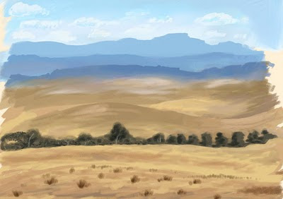
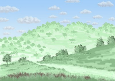
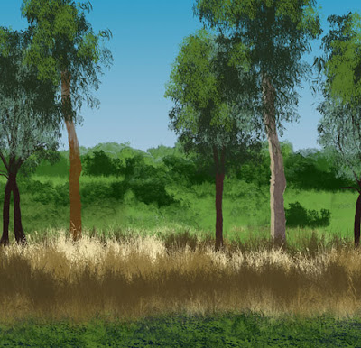
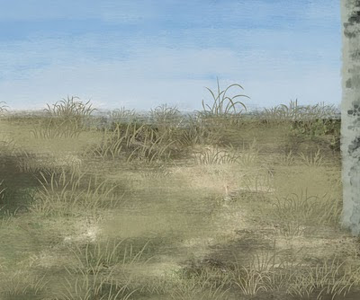
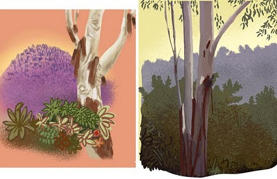
Here are a few more of my recent backgrounds of interiors and bush scenes.


These two interiors have a similar colour palette and technique, which is quite different from my other backgrounds.


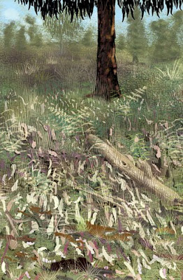
This last bushscape is pretty dense with grass and leaf texture.
I am getting a lot of good feedback on the tough little koala character.

Thursday, November 11, 2010

Suburban scapes Post #1

So this semester I carried on with more digital background images. This time I was trying to make more of them surburban and urban than bushscapes, although I did a couple of those too.

I also added some characters at the very end, I think they help focus the images a bit although keep in mind the background is the point not the characters. Maybe they are a bit too distracting.


The hard bit about adding buildings and man made objects is that suddenly perspective becomes a big issue. It isn't too apparent in the bushscapes but all the angles have to line up to some extent with a building or it just doesn't look right. So I drew and redrew the house above and pushed the perspective more each time to make it more cartoony and fun.


I also added a character to this bushscape and I really like the character, he's a goanna.

Bushscapes Post #3

Bushscapes- Some final images

I ended up doing 8 final images and you can see a selection of them below.
I found it hard to keep them stylistic and had to fight the urge to tighten them up and add too much detail.

I learnt a lot in making this first image, it went through several stages and helped set up the process properly.


This next image started off as a daylight scene and quite realistic, after several hours I dumped it all and began again with just a few simple stylised shapes and a much more interesting colour palette.


Here I also started with quite realistic colours and towards the end I changed it all to a weirder, Venusian palette.


Simple colours and strong graphic shapes seemed to work better, realism wasn't that important. Here I tried a raking sunset light hitting scribbly trees on big rolling hills.


I liked the raking light idea so I used it again on a simpler landscape with large empty grassy areas and detailed grass brushes in the fg.


This is a more realistic and carefully painted scene. I like the textures of the fg grasses and shadows. I was trying to get the feeling of distance with aerial perspective and that fence line leading the eye down past the dam and into the distance.

Bushscapes Post #2

Bushscapes 2 - Experiments

Having decided to use this idea as one of my proposals in my studies I did further research and tried a lot of different techniques.

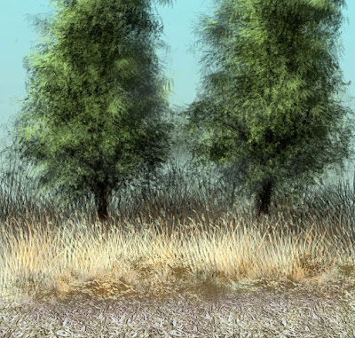
Here I have used a much more painterly approach in Painter.


I started this with a very quick Painter wash then added the trees with a single photoshop brush, same for the grasses


I tried lots more stuff with grasses to get the foreground looking better and work on the colours a little more.


I gathered a lot of photographic reference to help make the brushes. But as you can see here it didn't really work. It was all too specific and hard edged, and gets a bit too same-samey.


The Photoshop brush technique really wasn't working I needed more variation in texture and edges so I moved on to primarily using Corel Painter.

This proved much better as I could put specific textures in the paper surface and spray elements on with the image hose. It gave it a much more random and less mechanical look.


The results were encouraging, it was time to get into the final images...

Bushscapes Post #1

I am going to move this post from my old blog, just so that you can get up to speed on what I have been working on lately.


Bushscapes 1 early ideas

One of my big projects last semester was working on a technique to help me generate Australian bush landscape pictures, digitally.

They are supposed to be for use as animation or game backgrounds, maybe even backgrounds for kids books, etc.

I think these ones are still a bit too detailed, so I will have to work more at trying to keep them simple and more stylised.

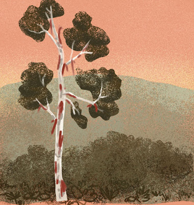
I started thinking about this late last year and took some early directions from the Hanna Barbera cartoons of Yogi Bear & The Flinstones as seen on John Kricfalusi excellent blog John K's Stuff.

Note the orange skies and such simple foliage.


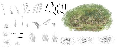
Then I tried using making some photoshop brushes, like this one of just one tree used over and over and a few grass brushes.


Here are several of my first brushes to get that scrubby bush look.


And using those brushes I made this image which I was pretty happy with as it only took about half-an-hour.

Finishing School


With only a few days to go before I finish my 3 year Bachelor of illustration course I thought I should get a few posts up showing some of the work.

I will be putting stuff up throughout the summer and into the new year as there is quite a few images after three years.

Here's a zombie fashionista to start with...

Saturday, November 6, 2010

Sunset near the tram stop


Just testing the upload image functions. Here is a vector image from near my house. Beautiful urban complication

The new blog

Hi and Howdy!

Welcome to my new blog. I will be phasing out my old one and concentrating on this one from now on. It might take a few weeks to really get going as I am wrapping up my final assignments in the 3 year Bachelor of illustration course at NMIT Fairfield. In fact this blog and my new website are part of the course.