Saturday, November 26, 2011

Secret Project

Here is a sneak peek at something I have been working on, a self initiated illustration project. Part of a double sided board game idea.

More to come on this...

Slight deviation


Yeah I know, it's been a while between posts, but I have been busy learning 3D software and doing tutorials and the like. The end result of someone else's tutorial isn't really the sort of thing you want to be posting on your own site.

Anyway I have a bunch of images from the last two months so I will try and get them up over the next week.

Here is some thing I have thinking about a bit. I grew up near the deviation in Geelong and it dominates the view from my parents house. Compare this recent shot to the one at the top which was taken way back in 1866.

I used to paint and draw it a lot back in the early 90's but haven't since then. A friend wants an acrylic on canvas painting but I have been enjoying doing it digitally. It is actually more dramatic than it looks in the photos so I wanted to push that as much as I could.

Started out in situ doing a few quick sketches and scanning those before trying a bunch of colour combinations.

Sketches


Colour roughs


A more finished rough


And a detail...


I have to make several alterations, the evening sky was a late addition and I will need to change the colour of the hills and trees to reflect that. I want to rework the foreground and then think about pulling out the old paints and brushes and getting down to the real work...
Font size

Tuesday, September 27, 2011

Sartorialist sketches


A few of my favourite figures form the great Sartorialist book and blog. The Sartorialist

A Zbrush dragon doodle


Here is a little Zbrush doodle of a dragon.

I have been learning the program for a while now and I am starting to be able to bend it to my will.

Some more landscapes/animation backgrounds


A few more of these bush layouts I made in early September ...

Some new landscapes


Sorry, it has been a while between posts.

I have been busy doing all different things but I thought I had better put some online.

Here are some quick animation layouts/background done in August.

More or less realistic or cartoony, but all done quite quickly in photoshop or painter.


Tuesday, July 12, 2011

Vincent Price Caricature


I've been working on this caricature of Vincent Price over the last week. I love Price's voice and demeanour. The regal king of horror who never took it too seriously. The final background is supposed to have some sort of cheesy 70's Asian restaurant vibe.

I found a great site that has a lot of his audio recordings which I listened to while doing the picture. (insert maniacal laugh here...)

Here is a work in progress image.


My initial sketch and colour guide, it started as a pretty straight portrait but soon changed into a caricature, much like Vincent Prices own career arc.

Saturday, June 18, 2011

illustrators Australia A3 exhibition 2011


Here are some images of songwriters from a series I am doing.

That new guy, Bobbie Dylan and the dark and brooding Nick Cave.

Quite graphic with Ben Day dots, strong lines.


I did meet Nick once but forgot to ask if I could call him my surrogate cousin.

These images were printed for the Illustrators Australia annual A3 show. There are some really good images from Dean Gorissen, Nigel Buchanan, Anton Emdin and especially a previous lecturer, the brilliant Andrea Innocent.
A3 show link

Tuesday, May 24, 2011

I am pretty excited about the fantastic GRAPHIC festival coming to the Sydney Opera House in late August.

Scott Mccloud, Jim Woodring, Peter Kuper and amazingly Robert Crumb!

I have bought my tickets and I'm especially looking forward to the masterclasses.

Long long ago on one of my first internet sites I conducted a short email interview with fantastic comics and stencil artist Peter Kuper. I think it was way back in 2001 or 2001.

It is still online and here is a link to it: Peter Kuper Stencil Art.

Of course most of the attention will be focused on that old curmudgeon R.Crumb! I think it is his first trip to Australia, I wonder if Aline is coming along too? It should be fun...

Friday, April 29, 2011

A few symmetrical doodles

Here are a couple of unfinished doodles done mainly in Zbrush. Start with a rough symmetrical lo-res blob and slowly up the resolution as you paint it into focus. The technique is from a great tutorial by Neville Page.
It is weird to only have to paint one side and have it magically appear on the other side. Of course the cyclops needs a lot more non-symmetrical work, but it would be kind of cool if we all grew hair and whiskers symmetrically.


Thursday, April 28, 2011

Fading Auto-Levels of Contrast...?

This is the first in what may become an occasional tutorial in the basics of digital imagery and manipulation.

Before we begin I have to state that this post wouldn't be possible without the excellent blog by David Apatoff.

Illustration Art. --> http://illustrationart.blogspot.com/

It is a really good resource and discussion area for a wide range on illustration topics. I posted a simple trick back in early March to help improve the quality of a few photos on his blog. http://illustrationart.blogspot.com/2011/03/one-lovely-drawing-part-35.html

David mentioned that he didn't really have time to learn the ins and outs of Photoshop
,my advice was well received and so I determined to give a few more little nuggets of help.

The overall quick-image-once-over would take me only about 5- 6 seconds per image but I thought I could break that down for you all. Once you understand what is going on, anyone can easily do this process to every image with only a few quick-key shortcuts in a few seconds.

A recent post has provided the perfect example to use some really quick techniques in Photoshop to improve scanned imagery of printed material and paintings. I know that many people might already use some or all of these techniques but may not know the whys and wherefores of what is actually happening. So here I will try to lay it out as simply and clearly as I can. I am only skimming over this stuff and showing you very quick and easy tricks.

If you are really interested you can look into it in much more detail in any photoshop book or online.
----------------
My Ode to An ODE to CONTRAST (Verse 5)

All the original imagery in this post come from the Illustration Art Blog.

http://illustrationart.blogspot.com/2011/04/ode-to-contrast-verse-5.html

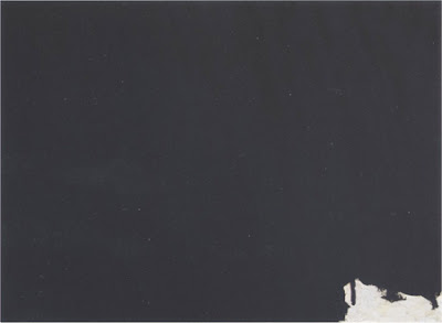
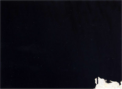
The first image is a painting by Robert Motherwell. It should provide a perfect example of what we are talking about here.


I would assume that Motherwell used black paint to for the majority of this painting, in the post on the blog the image appears as a vast dark grey area with a small light grey area bottom right.

The problem is that either the original painting has faded or the reproduction or scan isn't showing the right contrast. Something of the contrast has been lost and it is an important aspect as we are talking about contrast, and more specifically extreme contrast.

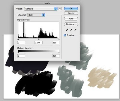
This sort of thing happens constantly in digital imagery and it is easily fixed. I find the quickest way to fix it is by using LEVELS in photoshop. Levels is found in the Image/Adjustment menu in the top menu.

It can also be brought up using the hot-keys (Command/Control) L. Levels brings up a little panel with Input Levels and Output Levels. We are only going to be concerned with Input Levels.


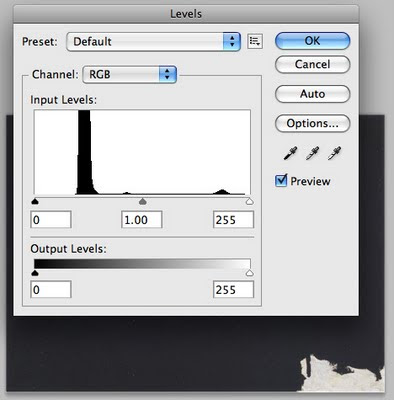
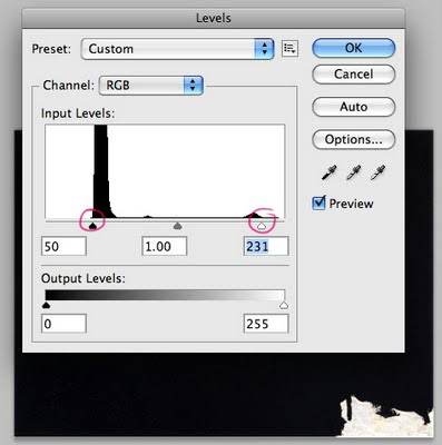
Input Levels are presented as a graph, don't panic, it is a pretty simple graph, in fact it's not called a graph but a Histogram.

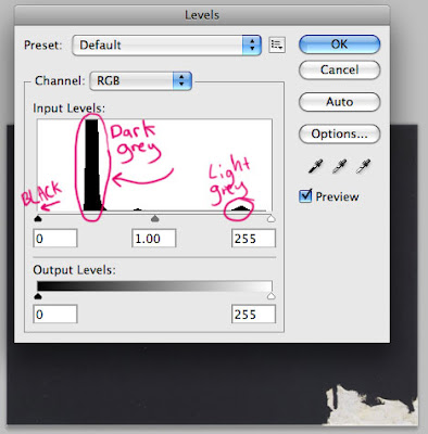
To understand levels you need to understand this histogram, what it shows is how much of each tone is in the image. Actual black is where the little black triangle is on the left and white is on the right with shades of grey across the middle with mid-grey at the triangle in the centre.

The histogram indicates how much of a particular tone is in the image, the higher the bump the more of that tone.

So what you would expect with the Motherwell painting is most of the graph action on the left (black) side and a little bit of graph action on the right(white side) but what happens when we look at the graph for this image?


Well, as you can see there are a lot of tones on the darker end and a little bump in the lighter tones area, and an inexplicable tiny lump to the left of the midtone arrow. Notice that their is a gap between the black arrow and the darker tone, this is the difference between the black shown and actual black. There is so much of this dark grey that it is not so much a bump as a vertical column.


Now to adjust this image lets drag the black triangle to where the black should be, so drag it in, then drag the white triangle in to the left. Drag the white one all the way to the little bump. Hopefully you can see the image while you are doing this and have preview turned on.


The final histogram should look like this after dragging.


If you like you can adjust the mid-tone triangle to you liking, moving it left will make all the mid-tones lighter and moving it right will darken them, usually it only needs a very slight adjustment.

Now that should be more like the original painting.


OK, that was pretty easy being a high contrast black and white image, lets try it with a colour one.

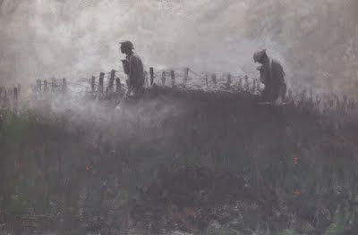
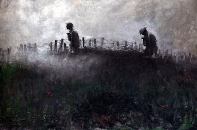
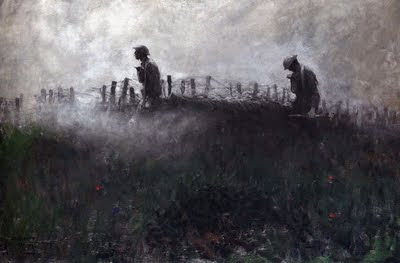
This Harvey Dunn image is fantastic with its smokey-murkyness.

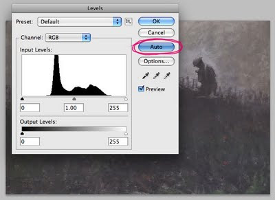
I think that maybe the actual painting may have discoloured a little over time as well as a lot of the contrast being lost in the scanning. For this one we will speed things up by using the auto-levels function. There is a danger using auto anything but it can still usually provide some improvement on almost any scanned image or photo provided you pay attention to the and are sympathetic to the image content.

Drag the image onto a document in photoshop and bring up Levels.

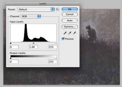
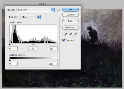
Notice that everything is once again in the middle with no real blacks or whites. At this point you could drag the two end triangles in (as before) and then adjust the mid-tone to your liking, but we are going to use the Auto button.


The Auto button assumes there is a black point and a white point and adjusts everything accordingly. There is a great danger in this assumption, especially in paintings where it is possible the artist never used actual black or white, maybe the picture is very high-keyed, etc. In this case Auto levels probably won't be the solution and you may need to carefully use levels manually. In illustration meant for reproduction I often find that there are in fact black and white points in the image.


What the auto-levels does here is typical as it is a bit too heavy handed and something is lost in the smokey-murkyness of the tonal range. Notice that it has also brought out some of the colours in the grass and few flowers.


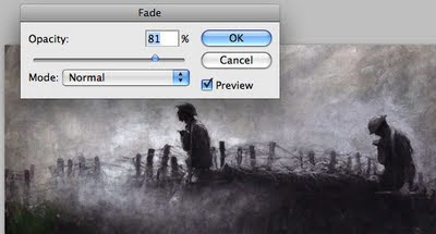
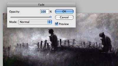
To fix this use the Fade function. It can be found under the Edit/Fade menu in the top menu, or use the hot-key (Command/Control) F.


The fade panel lets you fade back the last effect, in this case levels, as you pull it back the image returns to its previous appearance. Fade is good to use to pull back on all sorts of things, try it.
I found that about 80% seemed pretty good.


Done, now compare this image to the original Dunn.


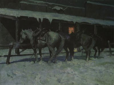
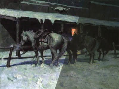
Here I have tried the same thing to the Mitchell painting and you can see the difference in the combined image.


I hope this has made sense and been of some help to David and anyone else using a range of imagery in their blogs or anywhere else.

Regards,
ROBin

Thursday, March 17, 2011

Incident at Sailor Jack


This is probably the largest illustrator/photoshop painting I have attempted. The original file is 50 cms square at 300 DPI. This incident between the eagle and sheep happened the first day of my three month stay on a remote farm at Sailor Jack on the NSW/Queensland border. The sheep ended up all right.

Here is a detail.